Exploratory Data Analysis On Haberman’s Cancer Survival Data set

In this article we will perform exploratory data analysis on haberman’s data set which is available on kaggle. We will use python for data analysis here.The data set contains cases from a study that was conducted between 1958 and 1970 at the University of Chicago’s Billings Hospital on the survival of patients who had undergone surgery for breast cancer.
The data set consists of following columns:
- Age of patient at time of operation(numerical)
- Patient’s year of operation (year — 1900, numerical)
- Number of positive axillary nodes detected (numerical)
- Survival status (class attribute): 1 = the patient survived 5 years or longer, 2 = the patient died within 5 year
Objective:
To find whether the patient will survive more than 5 years or die within five year based on age of patient,year of operation and number of positive axillary nodes
As first step we will import necessary libraries
import numpy as np
import pandas as pd
import matplotlib.pyplot as plt
import seaborn as snsow try to view
By default we have column names as 30.64, 1 and 1.1.we will change it based on the information that we got from kaggle.
df = pd.read_csv('haberman.csv',name=['age','year_of_operation','axillarynodes','survivalstatus'])Now view the head of dataframe.
df.head()
We can see that in survivalstatus it is given 1 for survived and 2 for not survived.It looks not good for EDA. So we will change 1 as ‘survived’ and 2 as ‘notsurvived’ by maping it. Also we want to change it to ‘category’ type.
df['survivalstatus'] = df['survivalstatus'].map({1:'survived',2:'notsurvived'})
df['survivalstatus'] = df['survivalstatus'].astype('category')
We will check some information about our dataset
df.describe()
df.shape
df['survivalstatus'].value_counts()
Observations:
- Total number of rows is 306 and columns is 4.
- There are no missing values.
- About 25% of people have no axilary nodes detected.
- Mean age of people is 52
- We can see that there are 225 people survived and 81 people not survived.As 225 is almost triple of 81,we can see that our target set is slightly imbalenced.
Uni variate Analysis
Distribution Plots:
Distribution plots are used for visualizing the data points with respect to frequency. Here the data points are grouped to bins.The height of bins depends up on the number of data points .That means height will be more for if the data points are dense and will be less for less data points.
sns.FacetGrid(df,hue='survivalstatus',size=4).map(sns.distplot,'age').add_legend()
plt.show()
sns.FacetGrid(df,hue='survivalstatus',size=4).map(sns.distplot,'year_of_operation').add_legend()
plt.show()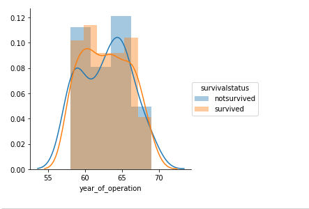
sns.FacetGrid(df,hue='survivalstatus',size=4).map(sns.distplot,'axillarynodes').add_legend()
plt.show()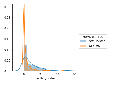
Observations:
- Distribution plots for ‘age’ and ‘year_of_operation’ are overlapping and we cannot obtain any clear conclusion.
- From Distribution plot of ‘axillarynodes’ we can see that among survived people number of auxillary nodes is dense from 0 to 5.
Cummulative distribution Function(CDF):
The cumulative distribution function (cdf) is the probability that the variable takes a value less than or equal to x.
survived = df[df['survivalstatus'] == 'survived']
not_survived = df[df['survivalstatus'] == 'notsurvived']count,edges = np.histogram(survived['age'],bins=10,density=True)
pdf = count/(sum(count))
cdf = np.cumsum(pdf)
plt.plot(edges[1:],pdf)
plt.plot(edges[1:],cdf)
print('survived:')
print('bin_edges: {}'.format(edges))
print('pdf: {}'.format(pdf))
print('***********************************************')plt.title('pdf and cdf of people based on age')count,edges = np.histogram(not_survived['age'],bins=10,density=True)
pdf = count/(sum(count))
cdf = np.cumsum(pdf)
plt.plot(edges[1:],pdf)
plt.plot(edges[1:],cdf)
plt.legend(['pdf of survived','cdf of survived','pdf of not survived','cdf of not survived'])
print('notsurvived:')
print('bin_edges: {}'.format(edges))
print('pdf: {}'.format(pdf))
print('***********************************************')

count,edges = np.histogram(survived['year_of_operation'],bins=10,density=True)
pdf = count/(sum(count))
cdf = np.cumsum(pdf)
plt.plot(edges[1:],pdf)
plt.plot(edges[1:],cdf)
plt.title('pdf and cdf of people based on year of operation')
print('survived:')
print('bin_edges: {}'.format(edges))
print('pdf: {}'.format(pdf))
print('***********************************************')count,edges = np.histogram(not_survived['year_of_operation'],bins=10,density=True)
pdf = count/(sum(count))
cdf = np.cumsum(pdf)
plt.plot(edges[1:],pdf)
plt.plot(edges[1:],cdf)
plt.legend(['pdf of survived','cdf of survived','pdf of not survived','cdf of not survived'])
print('notsurvived:')
print('bin_edges: {}'.format(edges))
print('pdf: {}'.format(pdf))
print('***********************************************')

count,edges = np.histogram(survived['axillarynodes'],bins=10,density=True)
pdf = count/(sum(count))
cdf = np.cumsum(pdf)
plt.plot(edges[1:],pdf)
plt.plot(edges[1:],cdf)
plt.title('pdf and cdf of people based on axillarynodes')
print('survived:')
print('bin_edges: {}'.format(edges))
print('pdf: {}'.format(pdf))
print('***********************************************')count,edges = np.histogram(not_survived['axillarynodes'],bins=10,density=True)
pdf = count/(sum(count))
cdf = np.cumsum(pdf)
plt.plot(edges[1:],pdf)
plt.plot(edges[1:],cdf)
plt.legend(['pdf of survived','cdf of survived','pdf of not survived','cdf of not survived'])
print('notsurvived:')
print('bin_edges: {}'.format(edges))
print('pdf: {}'.format(pdf))
print('***********************************************')

Observations:
- Patients with less that 35 age are defenitly survived.
- Patients operated between 1961 to 1965 have slightly higher rate of survial where as patients operated between 1965 to 1967 have slightly low rate of survival.
- About 83% of the survived people have less than 5 axillary nodes.Also about 58% of the non survived people have less than 5 auxillary nodes.
Bi Variate Analysis
Box Plots:
Box plots can be used to perform bi variate analysis.The three outliers of box plot represent 25th percentile,50th percentile and 75th percentile values respectively from bottom.The distance between 25th and 75th percentile values is known as inter-quar(IQR).About 50% of the points lie in IQR.Length of whisker is equal to 1.5 times IQR.
plt.figure(1,figsize=(14,4))
plt.subplot(1,3,1)
sns.boxplot(data=df,x='survivalstatus',y='age')plt.subplot(1,3,2)
sns.boxplot(data=df,x='survivalstatus',y='year_of_operation')plt.subplot(1,3,3)
sns.boxplot(data=df,x='survivalstatus',y='axillarynodes')

Violin Plots:
Violin plots are similar to box plots.But it also gives information about pdf.
plt.figure(1,figsize=(14,4))
plt.subplot(1,3,1)
sns.violinplot(data=df,x='survivalstatus',y='age')plt.subplot(1,3,2)
sns.violinplot(data=df,x='survivalstatus',y='year_of_operation')plt.subplot(1,3,3)
sns.violinplot(data=df,x='survivalstatus',y='axillarynodes')

Observations:
- Patients having age less than 35 is defenitly survived and patients with age greater than 75 are defenitly not survived.
Multi variate Analysis:
Pair Plot:
sns.set_style('whitegrid')
sns.pairplot(df,hue='survivalstatus',size=6)
plt.show()
observations:
- No specific information can be obtained from pairplot
Final Observations:
- Patients with less than 35 years of will survive 5 years or longer
- Patients with more than 75 years of will not survive 5 years or longer.
- Patients having less than 5 positive auxillary nodes have slightly high rate of survival.
- Eventhough we can reach at above conclutions we are unable to find out a perfect relation as the dataset is imbalenced.
If you like this article please upvote my kaggle kernel at https://www.kaggle.com/arunm8489/kernel8f6ec93dd6?scriptVersionId=8457280